App info and settings
This guide shows you how to implement the info screen and optional settings screen for your device app.
Prerequisites: Read the design guidelines introduction and review the app home screen guidelines before implementing the info and settings screens.
App information
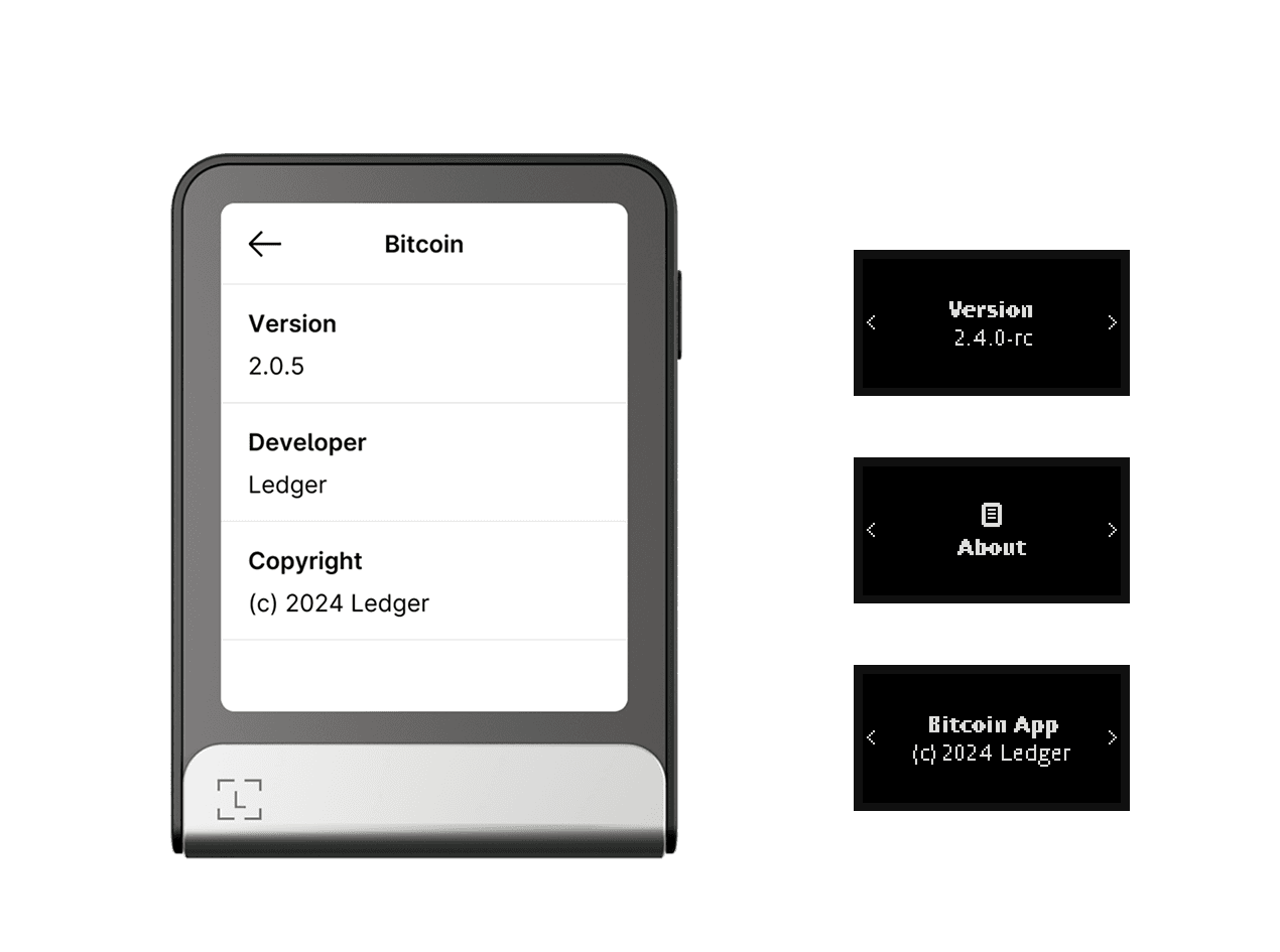
Your app must provide at least its version number and the developer name or organization. This information is part of the app’s resources and is used to automatically build a default version of the info screen.
 |
|---|
| The Bitcoin app’s info screen, on Flex and Nano devices. |
API
nbgl_useCaseHomeAndSettings()
This high-level API contains structures describing the info and settings of your app. View API docs.
If needed, you can add more information using the same format: rows of key-value pairs.
App settings
App settings are reset to their default values every time your app is updated or reinstalled after an OS update.
Ledger is currently working on solving this limitation by providing a backup-and-restore mechanism for app data. These guidelines will be updated when that mechanism is released.
Your app can have settings that unlock new capabilities or alter its behavior. As soon as your app includes a setting, the icon on the home screen changes from an “info” icon to a wheel icon.
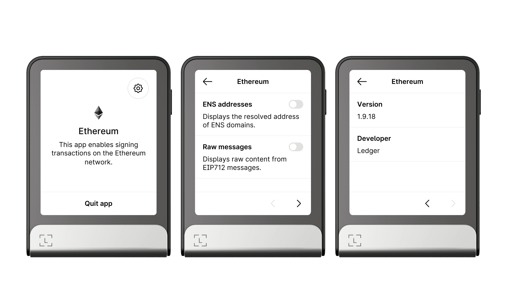
Settings must always appear before the app’s info, as shown in the Ethereum app example below. Navigation arrows are introduced automatically to split sections across their respective pages.
 |
|---|
| On Flex and Stax, the wheel icon leads to settings, which appear before the app’s info on the next page. |
Settings can use the following interactive elements:
- Toggle switches
- Radio buttons
- Tappable rows for navigation
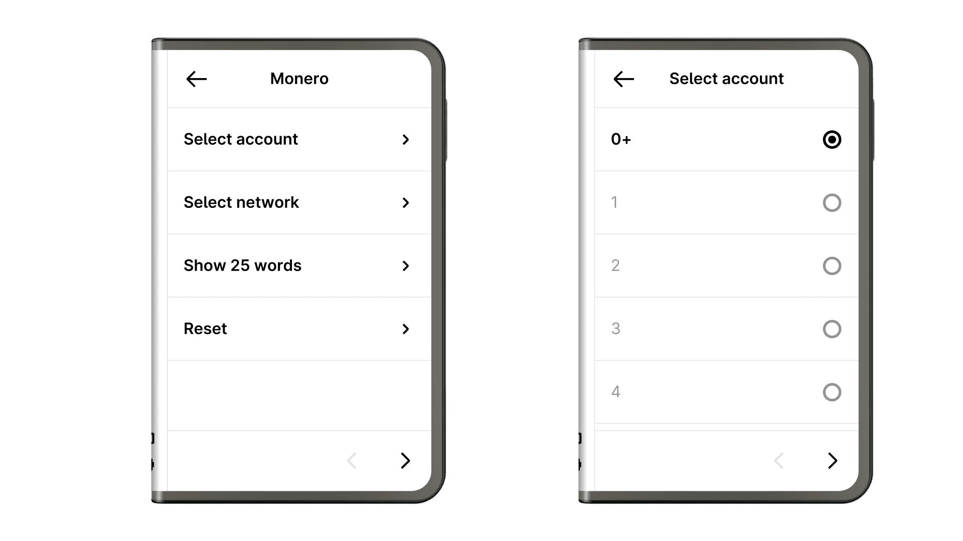
Tappable rows are used to introduce hierarchy and sub-settings. Do not mix interactive element types on the same page (for example, do not show both toggle switches and radio buttons on the same page):
 |
|---|
| The Monero app settings: a first level with tappable rows, and a second level of sub-settings with radio buttons. |
Key takeaways
- · Rely on your app’s resources to create a default info screen.
- · Avoid app settings whenever possible by choosing the best default behavior for the majority of your users.
- · When settings are needed, provide default values that suit the majority of users.
Next steps
- App home screen — how to design the home screen that leads users to settings and info.
- Transaction screens — how to implement the transaction review and signing flow.
- Advanced interactions — handling edge cases such as settings with sub-pages.