Display Management Design
Layouts
Layouts are nothing more than rules that specify the format / number of lines / fonts we are going to use on the screen. They are easy to remember once you understand that:
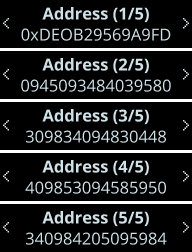
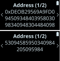
bstands for bold.nstands for normal.pstands for picture.pagingmeans that if the data doesn’t fit on screen, user will be able to navigate through multiple screens to see the data (e.g a public key).- Finally, the number of letters used stands for the number of lines
Note that not all combinations of letters are possible. For example paging only exists with bnnn. nnnn only exists on Nano X, etc…
This table contains the most commonly used layouts:
| Denomination | Comment | Usage |
|---|---|---|
bn | Bold font for the first line, normal font for the second line. | bn, {"BoldLine", "NormalLine"} |
pb | Picture for the first line, bold font for the second line. | pb, {&RefToPicture, "BoldLine"} |
pnn | Picture for the first line, normal font for the second line and third line. | pnn, {&RefToPicture, "NormalLine1", "NormalLine2"} |
bnnn_paging | Bold first line, normal fonts for the other lines. If the data to be displayed doesn’t fit on a single screen, the user will be able to navigate through different screens to see the whole text. | bnnn_paging, {.title = "BoldLine", .text = "NormalLine"} |
Most commonly used layouts
Here is a table that compares how those layouts are displayed on a Nano S and on a Nano X or S Plus.
Notice that the Nano X and S Plus can fit up to 4 lines, whereas the Nano S can only fit 2.
| LAYOUT | NANO S | NANO X and S Plus |
|---|---|---|
pb |  | |
bn |  | |
nn |  | |
pnn |  | |
bnnn_paging |  |  |